
Mobile devices have revolutionized the way we interact with the online world, bringing convenience and accessibility to our fingertips. For e-commerce businesses, a mobile-friendly website is no longer just a luxury; it is an absolute necessity. With Shopify, one of the leading e-commerce platforms, mobile optimization is made easier, allowing you to create a seamless shopping experience for your customers on any device. In this article, we will explore the best practices for mobile optimization in Shopify websites, ensuring that your online store attracts more visitors, achieves better sales conversions, and stays ahead of the competition.
1. Responsive Design is Crucial
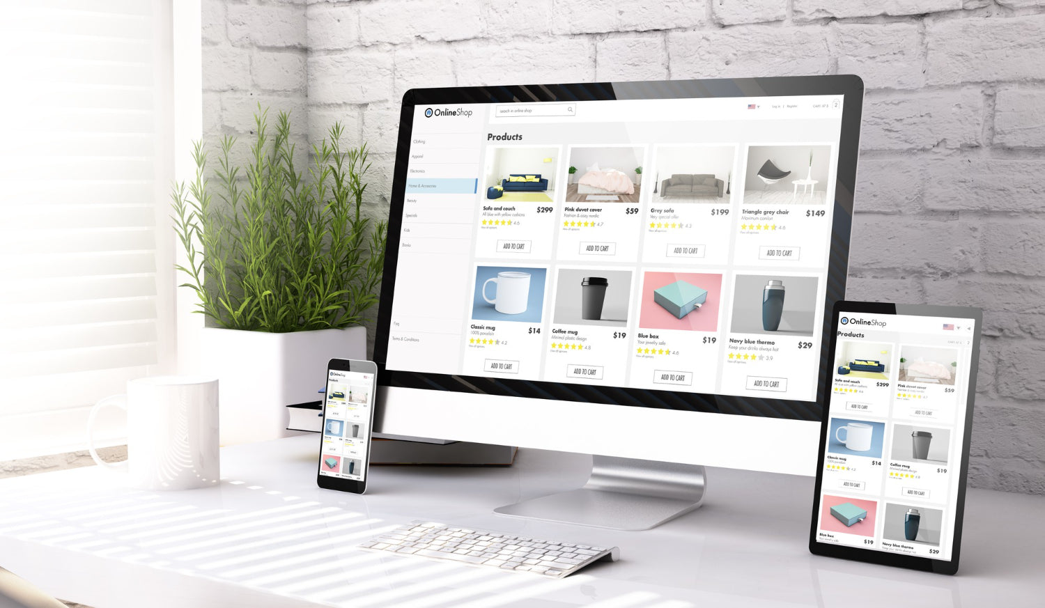
When it comes to mobile optimization, responsive design is the foundation. A responsive website automatically adjusts its layout and content based on the screen size and resolution of the device being used. This ensures that your Shopify store looks visually appealing and functions optimally on mobile phones, tablets, and even larger screens. A responsive design also boosts your SEO ranking, as search engines prioritize mobile-friendly websites when displaying search results.
2. Streamline Navigation
Mobile users appreciate seamless and intuitive navigation. Simplify your Shopify website's navigation menu for a mobile-friendly experience. Consider using a hamburger menu (a three-horizontal-line icon) to hide the menu items behind a collapsible panel. It saves precious screen space and allows users to access different sections effortlessly. Additionally, ensure that your website has a search bar prominently displayed, so users can quickly find what they are looking for.
3. Prioritize Page Speed
In the fast-paced digital world, every second counts. Slow-loading pages can frustrate visitors and lead to high bounce rates, adversely affecting your sales. Optimize your Shopify website's page speed by compressing images, minifying CSS and JavaScript files, and leveraging browser caching. Shopify's built-in optimization tools, such as lazy loading of images and dynamic loading of content, can also significantly improve your website's speed on mobile devices.
4. Implement Mobile-Friendly Fonts and Typography
Choosing the right fonts and typography is crucial for enhancing readability on mobile devices. While fancy fonts may look appealing on larger screens, they may become difficult to read on smaller screens. Opt for fonts that are clean, legible, and easily scalable. Ensure that the font size and line spacing are comfortable for reading on mobile devices. Remember, an effortlessly readable mobile website leads to better user engagement and increased conversions.
5. Optimize Content for Mobile Viewing
When designing content for mobile users, keep it concise, focused, and visually appealing. Break lengthy paragraphs into smaller paragraphs, bullet points, or subheadings to make them easier to scan. Use shorter sentences and adopt a conversational tone to maintain user interest. Incorporate eye-catching images, videos, or infographics to enhance the visual appeal of your content, ensuring it captures and retains the attention of your mobile visitors.
6. Don't Forget About Thumb-Friendly Navigation
Mobile users interact with their devices primarily using their thumbs. Design your Shopify website with this in mind. Place important elements, such as buttons and links, within easy reach of the user's thumbs to ensure effortless navigation. Avoid placing interactive elements too close together, as this can result in accidental taps and frustrating user experiences. Remember, user-friendly navigation contributes to increased engagement and conversions.
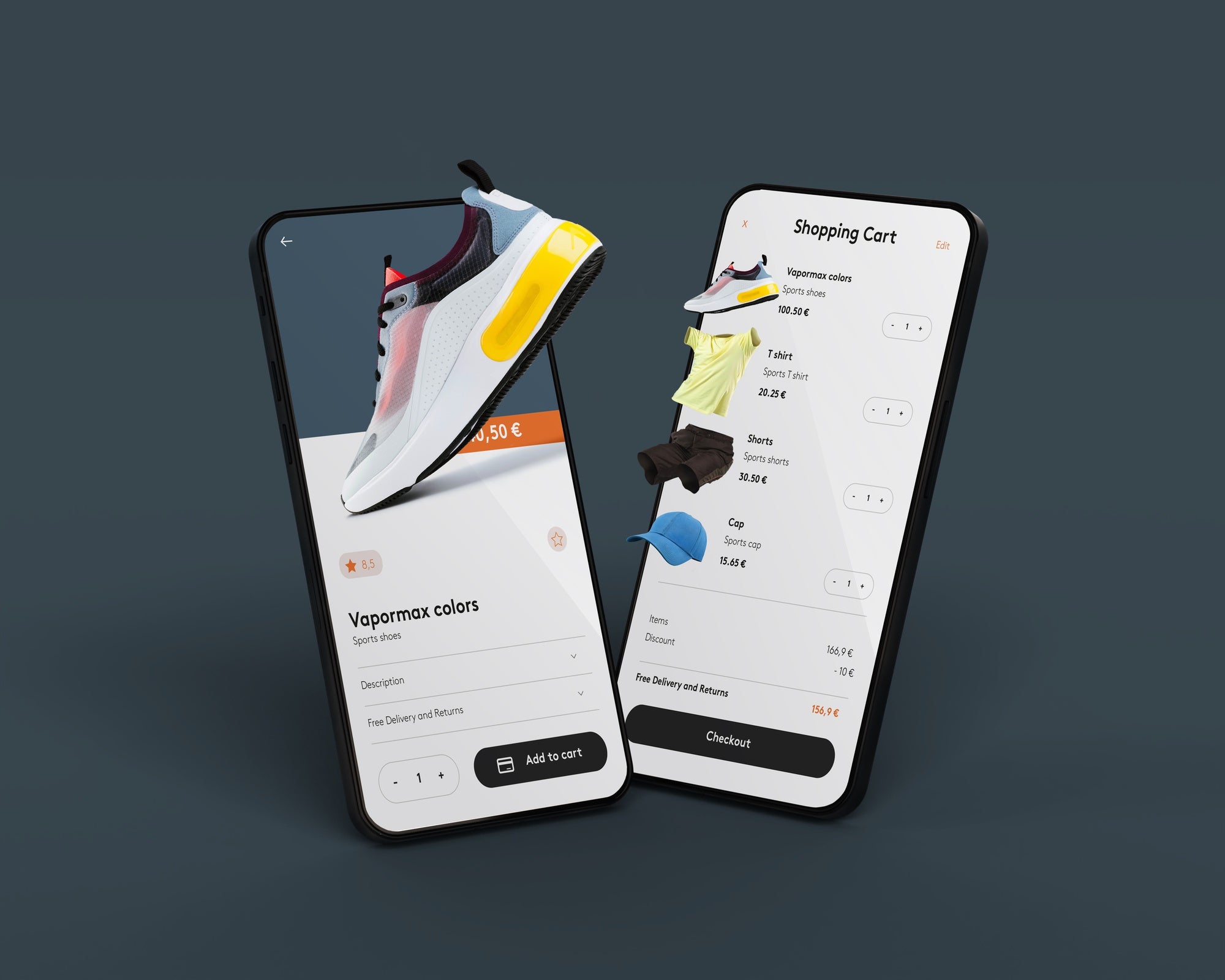
7. Mobile-Optimized Checkout Process
A streamlined and mobile-optimized checkout process is vital for reducing cart abandonment and ensuring a smooth customer journey. Minimize the number of steps required to complete a purchase and implement auto-fill features for shipping and payment information. Include multiple payment options, such as Apple Pay and Google Pay, to cater to a variety of mobile users. By creating a seamless checkout experience, you can boost your sales and increase customer satisfaction.
8. Optimize Metadata for Mobile Search
Metadata plays a crucial role in your Shopify website's SEO marketing. Ensure that your webpage titles, meta descriptions, and image alt texts are optimized for mobile search. Google's mobile-first indexing means that having optimized metadata specifically tailored for mobile devices is more important than ever.
9. Mobile Testing and Optimization
Testing your Shopify website on various mobile devices and screen sizes is essential to ensure consistent performance and user experience across the board. Take advantage of Shopify's built-in responsive preview feature or use third-party tools to test and optimize your website for different mobile devices. Pay attention to the overall responsiveness, page load times, navigation flow, and readability during the testing phase to identify areas that need improvement.
10. Leverage Accelerated Mobile Pages (AMP)
Accelerated Mobile Pages (AMP) is an open-source initiative that allows you to create incredibly fast-loading web pages for mobile devices. By implementing AMP in your Shopify website, you can significantly improve page load times, increase user engagement, and enhance your SEO ranking. Shopify offers AMP integration through various plugins and themes, making it easier for you to unlock the benefits of this powerful optimization technique.
11. Regularly Update and Maintain Your Shopify Website
Keeping your Shopify website up to date is essential to ensure optimal performance and security. Regularly update your themes, plugins, and apps to access the latest features, bug fixes, and security patches. Additionally, review your website's analytics data to identify areas that may need improvement. Monitor user behavior, conversion rates, and customer feedback to make data-driven decisions in optimizing your mobile user experience further.
12. Continuously Monitor and Evolve Your Mobile Strategy
The digital landscape is ever-evolving, and so should your mobile optimization strategy. Stay updated with the latest trends, industry best practices, and technological advancements to continually improve your Shopify website's mobile experience. Analyze your competitors' mobile strategies and implement innovative ideas that align with your brand to stay ahead of the game. Remember, a continuous effort to optimize your mobile experience will result in increased traffic, improved conversion rates, and long-term success.
Unlock Success with Mobile Optimization
In this mobile-dominated era, mobile optimization is not just an option; it is a necessity. By implementing the best practices discussed above, you can create a mobile-friendly Shopify website design that attracts more visitors, provides an exceptional shopping experience, and drives sales. Embrace responsive design, streamline navigation, prioritize page speed, optimize content, and continuously monitor and evolve your mobile strategy to unlock success in the competitive e-commerce market. Remember, a seamless mobile experience is the key to unlocking your e-commerce store's full potential and achieving sustainable growth.


Share:
Mastering On-Page SEO in Your Shopify Store
The Vital Role of Content Marketing in Shopify Ecommerce